Advance Typography - Final Project
11/6/2019- 2/7/2019 (Week 11- Week 14)
Lee Yu Hui | 0335787
Advance Typography
Final Project
Lectures
Week 11- 11/6/2019
This week we were introduced to 2 topics: Typography: Perception & Organization and Typography in Different Mediums.
Instructions
Final Project
For our final project, we were given the freedom to choose either develop a font that is intended to solve a larger problem or to explore the use of typeface, understand its existing relationship, identify areas that could be improved upon, explore possible solutions or combinations that may add value to the existing typeface.
I first came up with the idea of creating a typeface for the blind, and the outcome was to create a installation sort of thing to allow the blind to "feel" the letters. However, this idea quickly got scraped as there is already an existing system for the blind to read.
The second idea came up after I saw a no smoking poster sign in Taylor's and I wanted to re-design the typeface that was used in the signboard, and to create something that could help gain more awareness and attention through the use of photography. However, Mr. Vinod said it'll be difficult for me to come up with a new sign to achieve my goals, and hence this idea also got scraped.
The third idea was to re-design a poster made by the government, as I think government made posters are mostly too colorful and the information is way too cramped. I showed Mr. Vinod and Mr. Shamsul the example posters that I found off Google, but they reminded me that my goal is to create a new typeface, and hence this idea also got put off.
The final idea came in when the lecturers said that we can do something that is related to our specialization. In my case, its animation. I looked through the popular animation studios and I decided to redesign the typeface for the logo of Dreamworks studio. I noticed that Dreamworks typeface is flat and I feel like it doesn't represent the title well and given that it produces a lot of kids movie, I feel like it could be better, hence I choose to focus on redesign the typeface for Dreamworks animation.

Fig 1.0
So I did some research regarding to the typeface used for DreamWorks. Apparently the typeface used for DreamWorks is similar to the typeface Minion Pro Black, and the word 'SKG' represents the three founders, namely, Steven Spielberg, Jeffrey Katzenberg and David Geffen.
I knew I wanted something that is rounded and slightly bold, hence I used Arial Rounded Bold as my reference for the typeface design.
Fig 1.1 My first attempt
After showing to Mr. Vinod via Facebook, he said that the face are consistent, but he didn't understand why I placed dots and gaps in between my letters.
I evaluated my work after getting feedback from him, and started to sketch out a couple other variations as well.
Fig 1.2 Sketches that I made
I showed Mr. Vinod my sketches and he thinks that the image on the bottom looked better than the one on the top, hence I started digitizing it in illustrator.
Fig 1.3 First attempt on digitizing
After showing the results to Mr. Vinod and Mr. Shamsul, they both find it interesting, but they asked me to adjust and change up a few letters like E, M, N, W, S
Fig 1.4 Second attempt on digitizing
I made some changes to the letters and then I placed them together with the mark and play around with the layout. Mr. Vinod says that the letters M, N, S still has the same issue, and that he thinks that the larger DW looks awful in the mark.
Fig 1.5 Third attempt
I tried changing the letters again, but this time, I took reference from the typeface called Bauhaus.
Mr. Vinod pointed out that the smoothness of the curves can be improved, hence I tried to make the lines more smoother.
After adjusting the curves, this is my final product!
Outcome of capital Roman Letters
Application of typeface
Variations of the mark with the typeface
Video application of the typeface
PDF of the application
Feedback
Week 11
Specific Feedback:
After proposing my ideas to Mr. Vinod and Mr. Shamsul, they weren't really satisfied with the ideas proposed, and they also asked me to change minor things for my project 2, but overall they liked the typeface that I created for my key artwork. Mr Shamsul also reminded me to update my further reading.
General Feedback:
Mr. Vinod and Mr. Shamsul urge that we upload our images in JPEG rather in PNG to our blogs. And as for our final project, the lecturers said that we have to have a purpose for our proposed idea, and that we should be clear of our solutions and purpose.
Week 12
Online Feedback:
It’s a consistent looking face. Why the gaps and the dots? Also, are there any other variations? And variations in positioning the mark with the logotype?
Week 13
Reflection
Experience
Week 11
I was really clueless about what I wanted to do for my final project, as my ideas got rejected and some of them is not up to my satisfaction. It was a bit stressful to be honest, and a little scared, nevertheless, I decided that I would do some reading and hopefully I'll be able to come up with something.
Week 12
I felt a little stressed as I realized that designing an existing brand's typeface meant that I have to do better than the previous one, and it took me a long time to figure out which kind of designs I'm going for.
Week 13
We continued our final project in today's class, and I felt a little relieved that Mr. Vinod and Mr. Shamsul approved of my idea. Overall, it was pretty stressful as it's near submission date, but still have to keep moving on.
Week 14
This class is a little tense as our submission is today, and it's basically our last class in Advanced Typography, hence I also felt a sense of mixed emotions as this class is ending.
Observation
Week 11
I notice some people around me are having the same problems as me, however there are also people who had a clear idea of what they wanted to do for their final project. This made me feel a little left behind and I urge myself to read more to gain inspirations.
Week 12
I saw a lot of people having really cool ideas for their final project, and some are still rather clueless. Nevertheless, we still try and work and get feedback from this class.
Week 13
I notice a lot of people are starting to get their final project done and some have even produced their outcome for their project.
Week 14
I notice a lot of people are finishing their blogs and most of them are done with their final project already.
Findings
Week 11
Having ideas is not the hardest part, often times execution is the hardest part, as quoted from Mr. Vinod. I find that it's always hard to go out of boundary, even with design.
Week 12
I realize that looking for ideas can be equally as challenging as I personally prefer to brainstorm what my "solution" would be along with the problem that I'm trying to solve.
Week 13
I find that designing typeface requires a lot of attention to details, in order to make it look consistent. Little curves and edges makes a lot of difference and would give off a whole different vibe.
Week 14
I realize that as this class is ending, I felt sad and happy at the same time, mainly because I know that I won't be seeing Mr. Vinod and Mr. Shamsul as much next semester, and I'm grateful for their guidance over the past 2 semesters.
Further Reading
Week 11
Basic Design Typography


Specific Feedback:
Mr. Vinod and Mr Shamsul find the typeface that I designed to be quite interesting, but there's a few alphabets that I have to improve on, such as the letter D, X, Y, Z. He told me that I have to try to make it look consistent.
Online Feedback:
1. There are still clear issues with MNS ... the type must be smooth in its curves. You need to be more critical when looking at your type. If you feel you have no more time and energy and you want to run with this I will understand. Also, stop using the D and W larger in the logo. It looks awful!
2.There are still lots of issues smoothness of the curves and such. but just do what you can. Are these strokes or paths? You would be able to control the form better if they were strokes.
Reflection
Experience
Week 11
I was really clueless about what I wanted to do for my final project, as my ideas got rejected and some of them is not up to my satisfaction. It was a bit stressful to be honest, and a little scared, nevertheless, I decided that I would do some reading and hopefully I'll be able to come up with something.
Week 12
I felt a little stressed as I realized that designing an existing brand's typeface meant that I have to do better than the previous one, and it took me a long time to figure out which kind of designs I'm going for.
Week 13
We continued our final project in today's class, and I felt a little relieved that Mr. Vinod and Mr. Shamsul approved of my idea. Overall, it was pretty stressful as it's near submission date, but still have to keep moving on.
Week 14
This class is a little tense as our submission is today, and it's basically our last class in Advanced Typography, hence I also felt a sense of mixed emotions as this class is ending.
Observation
Week 11
I notice some people around me are having the same problems as me, however there are also people who had a clear idea of what they wanted to do for their final project. This made me feel a little left behind and I urge myself to read more to gain inspirations.
Week 12
I saw a lot of people having really cool ideas for their final project, and some are still rather clueless. Nevertheless, we still try and work and get feedback from this class.
Week 13
I notice a lot of people are starting to get their final project done and some have even produced their outcome for their project.
Week 14
I notice a lot of people are finishing their blogs and most of them are done with their final project already.
Findings
Week 11
Having ideas is not the hardest part, often times execution is the hardest part, as quoted from Mr. Vinod. I find that it's always hard to go out of boundary, even with design.
Week 12
I realize that looking for ideas can be equally as challenging as I personally prefer to brainstorm what my "solution" would be along with the problem that I'm trying to solve.
Week 13
I find that designing typeface requires a lot of attention to details, in order to make it look consistent. Little curves and edges makes a lot of difference and would give off a whole different vibe.
Week 14
I realize that as this class is ending, I felt sad and happy at the same time, mainly because I know that I won't be seeing Mr. Vinod and Mr. Shamsul as much next semester, and I'm grateful for their guidance over the past 2 semesters.
Further Reading
Week 11
Basic Design Typography

Book Cover
Type Generation
Type generations refers to the different applications or approaches used to create letterforms. Designers harness attributes in the generated type in order to add to, or reinforce, the message they want to convey via the design.
Hand-drawn type
Although there have been many attempts to emulate handwriting in type, none compare to those inherent idiosyncrasies generated from changes in pressure, speed and concentration - that grace handwritten script. The only way to obtain the unpolished feel of handwriting script is to draw the typography and return to mark making in its most basic form. For some this is a reaction against the occasionally bland nature of modernist typography.
Week 12
Typex: Hernan Ordonez

Book Cover
This book is about teaching experience of the author Hernan Ordonez that brings together some of the many works carried out by students at Kunsthal design school in Irun. This is interesting as many of the students works are published here, along with description of the works. As I'm doing my final project, this book would be a great source of inspiration and knowledge.
This image in particular caught my attention as it reminds me of the typeface that I'm designing.
The use of typographic systems in the designs.
Week 13
Type Team: Perfect Typeface Combinations

This book showcases different typefaces made by different designers with descriptions of their work. What I find interesting is the fact that the typefaces are divided and categorized in genres, such as Humorous, Hand Drawn, Sporty and so on. The book also talks about different principles of type, and provided nice visuals for the readers.
Below are some works that I find interesting:
Week 14
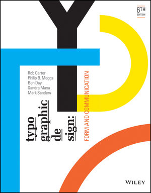
Typographic Design: Form and Communication

Typographic Design: Form and Communication

Book Cover
This book covers every aspect of designing with type, from stroke weight, to syntax, to legibility, and structure.
Typographic Space
Spatial elements are balanced through the principle of visual compensation, achieving equilibrium and tension. The structure of typographic space can be defined by alignments and for-to-void relationships that establish a composition's underlying spatial order, This substructure id developed and enhanced through optical adjustment. Visual compensation is achieved by balancing elements against each other, adjusting their sizes, weights, spatial intervals, and other visual properties until unity and equilibrium are achieved.


Comments
Post a Comment