Advance Typography - Project 2

28/5/2019- 4/6/2019 (Week 9- Week 10 )
Lee Yu Hui | 0335787
Advance Typography
Project 2
Lectures
Week 9 - 28/5/2019
There was no lecture class this week, we continued on our project 2.
Week 10 - 4/6/2019
There was no class this week due to public holiday.
Instructions
Project 2
After we got done with the key artwork, we move on to the collateral. We had to choose to work on three different collateral, and I ended up choosing poster, t-shirt, and a tote bag.
Poster
I started by making the poster. I made a few attempts on the poster.

First attempt
Mr. Vinod said that the poster looks more like a movie poster, so I change up and made a few variations.


A few more variations
After showing to Mr. Vinod, he didn't like the layout for the poster, and so I changed a few things according to Mr. Vinod's suggestion.


Fig 1.0 Few more attempts.

Poster Final Attempt
T-Shirt
Since my key artwork is simple and straightforward, I decided to go with something minimal and simple.

Attempt 1
After getting feedback from Mr. Vinod, he asked me to place the word 'Manifesto' with the key artwork.

Final T-Shirt Design
Tote Bag
My third collateral I decided to do a tote bag, since I think it'd be nice and suitable for events.

Initial Designs
After sending in the designs to Mr. Vinod, he said the one on the right is ok, hence I used the design on the right as the final design.

Final Tote- Bag Design
Microsite
In our interactive design class, we also made a microsite for the event, so here's the link to the microsite:
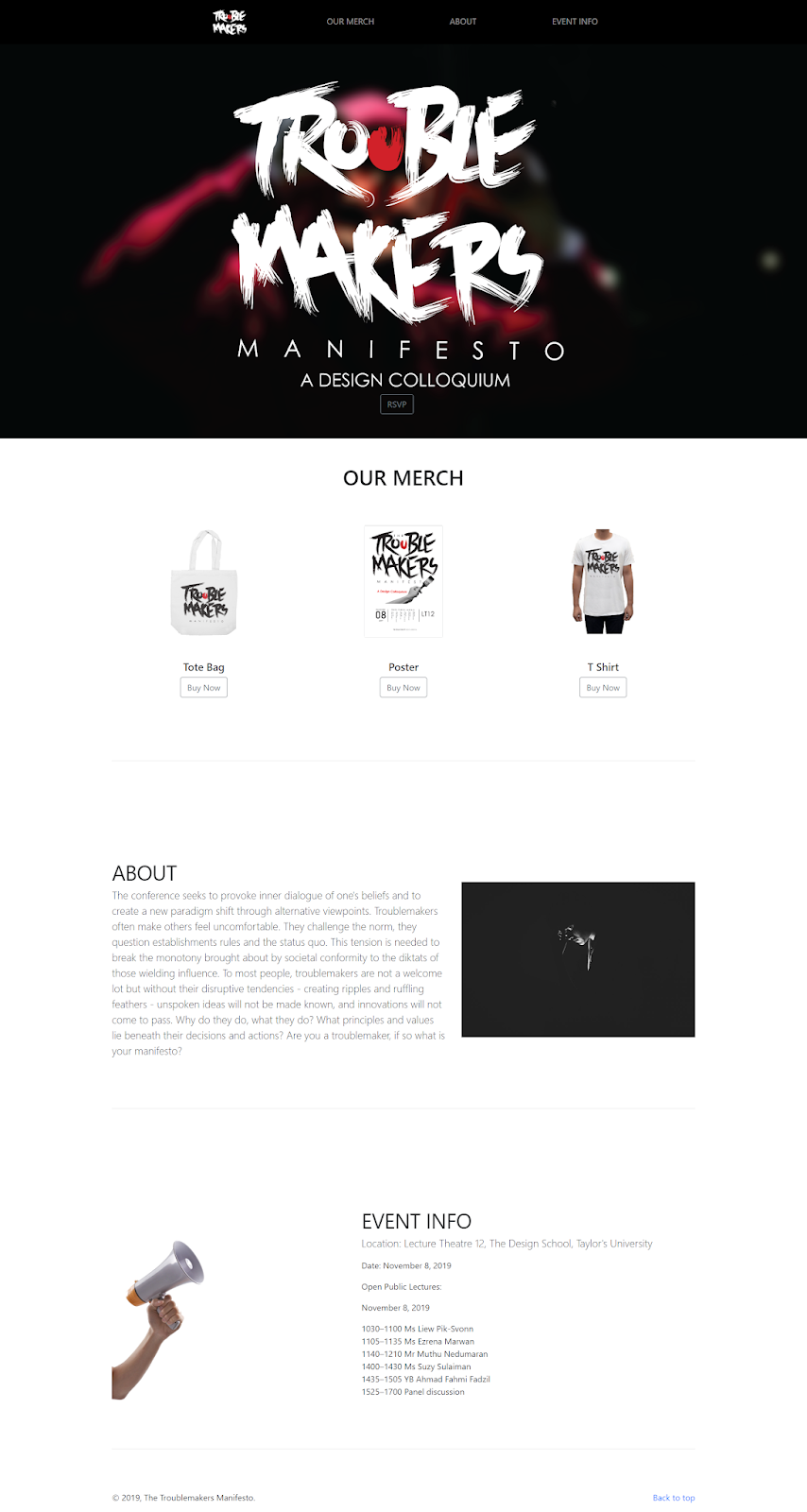
Still image of the website
Collaterals Outcome
Image

Collateral 1: Poster
Collateral 2: Microsite
Collateral 3: T-Shirt
Collateral 4: Tote-Bag
PDF
Poster PDF
Microsite PDF
T-Shirt PDF
Tote Bag PDF
Printed Work

Printed T-Shirt Collateral
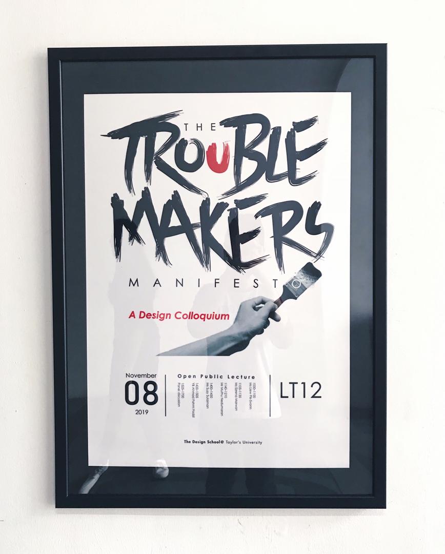
Printed Poster Collateral
Final Compilation

Final Compilation
Embedded PDF of Final Compilation
Feedback
Week 9
Specific Feedback:
Mr. Vinod said that my poster looked too much like a movie poster, and that my information is taking the attention from the key artwork. I made a few attempts but the layout is just not there yet.
Week 10
Specific Feedback:
Hi, just move on with what you have here. Not more time to spend on it ok.
Week 10
Specific Feedback:
Hi, just move on with what you have here. Not more time to spend on it ok.
Mr Vinod also approved of my tote bag design, and as for the shirt design he asked me to decide myself.
Week 11
Specific Feedback:
After proposing my ideas to Mr. Vinod and Mr. Shamsul, they weren't really satisfied with the ideas proposed, and they also asked me to change minor things for my project 2, but overall they liked the typeface that I created for my key artwork. Mr Shamsul also reminded me to update my further reading.
General Feedback:
Mr. Vinod and Mr. Shamsul urge that we upload our images in JPEG rather in PNG to our blogs. And as for our final project, the lecturers said that we have to have a purpose for our proposed idea, and that we should be clear of our solutions and purpose.
Reflection
Experience
Week 9
This weeks class is a little stressful as I couldn't get the layout right and I wasn't satisfied with it.
Week 10
This week we didn't have any class due to public holiday.
Observation
Week 9
I noticed a few people who had really nice layout for their poster design. I am amazed by their artwork.
Week 10
This week we didn't have any class due to public holiday.
Findings
Week 9
This week I learned the importance of reading and observing through various sources.
Week 10
This week we didn't have any class due to public holiday.
Further Reading
Week 9
What is Typography?

Novelty
During the eighteenth century, a major cultural movement toward neoclassicism had been developing. Italian Giambattista Bodoni epitomized the beau ideal of neoclassicism. His typefaces also erased, finally and completely, any lingering suggestions of handwriting. Some said that Bodoni's books are designed to be looked at rather than read. This was the first time that the appearance of type had been consciously designed to reflect esthetic taste or fashion, placing appearance above readability. Historians of typography usually ignore novelty types and limit themselves to the study of book types, but it is generally agreed that although the Victorians lost the idea of good type to read this does not necessarily mean that they lost the idea ''of good lettering".
Week 10
The Field Guide to Typography | Typefaces in the Urban Landscape

This is a book that talks about different typefaces as well, as it provides the history of each typefaces development in detail. I decided to look through a few typefaces that I find interesting.
Cochin
Georges Peignot of Paris foundry Deberny & Peignot created 2 typefaces called Cochin, with the second designed later in 1914. This typeface is inspired by French Artist Nicolas Cochin's cooper plate engravings, and Cochin's elegant style made it a popular choice at the start of the twentieth century. Cochin has an unusual appearance with heightened ascenders, widened lower-case figures and a square up aesthetic to many of its upper-case letters.


Comments
Post a Comment