Advance Typography - Project 1
14/5/2019- 21/5/2019 (Week 7- Week 8 )
Lee Yu Hui | 0335787
Advance Typography
Project 1
Lectures
Lecture Notes
Week 7 - 14/5/2019
Week 8 - 21/5/2019
There was no lecture class this week. We continued with our project,
Instructions
Project 1
For our first project, we are required to create a key artwork for the Troublemakers Manifesto.
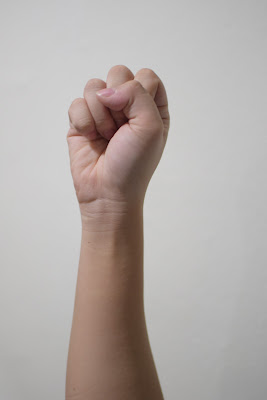
I initially came up with the idea of using a hand as a symbolism and key artwork for my project. I took a picture of my hand in a fist, and using Photoshop to mask and edit my image.
Fig 1.0 Original image taken
Fig 1.1 Image after editing in Photoshop
Using the fist as the key artwork, my initial idea was to squeeze the word "Troublemakers".
Fig 1.2 Initial attempt
After getting feedback from Mr. Vinod and seeing what others have done, I feel like its not unique enough and I need to explore more from this aspect. I then decided to try on something new.
I thought of using cards as I think that troublemaker is like a wild card, they're full of surprises, and hence I try looking at cards and tried to come out with a couple of designs.
Original image
Edited image
Few attempts I made
After showing to Mr. Vinod, he said that the thought process is accurate, however the designs are not there yet. I was kind of stuck as I don't know how to proceed with that, and so I took another different approach.
As Mr. Vinod urges us to have more local elements to our designs, I thought of graffiti and spray paint, as I thought that they're the "troublemakers" in art.
Using stock photos that I found online, I photoshopped them and placed them accordingly. I played around with different elements and texts to make them look more interactive.
A few more attempts I made.
I showed Mr. Vinod again, and he suggested that I remove the man with the paintbrush as it felt forced. He then suggested I could just draw out the word troublemaker to make it look like a graffiti.
Attempts using brushes in illustrator
Mr. Vinod and Mr. Shamsul said that the one in the middle (second row) looks much better, but it doesn't seemed like it came out of spray paint.
Mr. Vinod then suggested that I use a paint brush instead of a spray can.
Another attempt
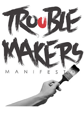
Final Design
Feedback
Week 7
General Feedback:
According to Mr. Vinod, the biggest challenge that we are facing is the lack of read. He stated that we need to read more, and that he say that we need to keep in mind that right now what we're producing is a key artwork, not a poster. Key artwork is something that can be applied anywhere.
Specific Feedback:
Mr. Vinod and I agree that I need to explore more as I notice a lot of people are doing the same key artwork.
Week 8
Specific Feedback:
Mr. Vinod suggested that I remove the unecessary visual elements (the paintbrush with the jumping man) as he thinks that it's doesn't really bring the message that I'm trying to convey. Then he suggested that I just draw out the word Troublemaker as my artwork is related to spray paint, and I tried multiple attempts, but it still wasn't there yet
Online Feedback:
The thicker type option is better BUT you have a spray can and brush letter... easier solution would be to drop the can. Also, it’s “troublemakers manifesto”
Reflection
Experience
Week 7
We started working on our first project, and it was hard to brainstorm an original design. Nevertheless, I had fun playing around with different concepts and images.
Week 8
This week we continued with the project and I made a lot of attempts but none of them seemed unique and nice. I was a little frustrated as I couldn't come up with good designs.
Observation
Week 7
I saw a lot of people doing the same thing at first, which is the use of fists and hands. I was a little surprised to find out that a lot of people think the same when it comes to design.
Week 8
I was surprised with some of my friends work, some produced really nice designs and I hope to achieve that someday.
Findings
Week 7
I realized that it is hard to come up with original designs as people more or less think about the same thing when given a topic. The final goal was to think out of the box, and to think beyond the boundaries.
Week 8
I notice that in order to get inspirations, reading is a must as we often gain inspirations at looking at good design works and learn from them.
Further Reading
Week 7
I Love Type Series- Volume Four

This is a book series which is published by Viction:nary. This book consists of works of other designers, from magazines to posters. As I'm working at project 1 right now, it's a great source of inspiration as I got to see what the others have done. Some designers have used the combine elements of graphic and typography for their work, and the way the elements is aligned is really interesting as well. I've always like the style of sophistication and minimalist, hence it really opened my eye to what others have done in terms of style and themes.
Week 8
Typeface: Classic Typography for Contemporary Design

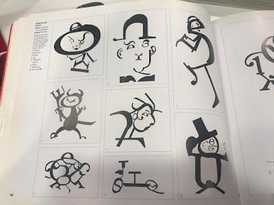
This book focuses on different typeface and it talks about its history and how it got developed. They talk about typefaces like Bembo, Caslon, Times New Roman and etc, and how it was applied in artworks and designs. One in particular that I find interesting is the Centaur typeface. This is not really a well known typeface compared to Century or Garamond, however I was amazed by the examples that was shown to me, about how designers applied the typeface to make it into different characters.
The authors uses parts of different letters to form a character, and I find it really cool and innovative. According to the book, Centaur is designed by an American named Bruce Rogers, and he was one of the finest typographers and book designers of the 20th century. Centaur is designed by Rogers as an exclusive typeface for the Metropolitan Museum of Art in 1914, and with Centaur, Rogers undertook to emphasize the printed quality of Jenson's original forms.


Comments
Post a Comment