Advance Typography - Exercise

2/4/2019- 7/5/2019 (Week 1- Week 6)
Lee Yu Hui | 0335787
Advance Typography
Exercises
Lectures
Lecture Notes
Week 1- 2/4/2019
Introduction
Our first class consists of Mr. Vinod and Mr. Shamsul giving us a brief about our module for this semester. He then told us to prepare a presentation slides based on the typography systems. For my group we were chosen to do the topic "random". The lecturers also then explained that we'd had to design a 200mm x 200mm poster with the content given to us using the typography systems, and we should come out with 16 drafts in total by the next class.
Week 2- 9/4/2019
Typographic System
We start off our class with the presentations about the typographic systems from each group. The presentations were clear and direct, but we got into a heated debate with the gridded system. In the end we did came up with a conclusion, so the debate was worth it. Nevertheless I did gotten a better understanding about the typographic system from each group.
Week 3- 16/4/2019
Typographic System Exercise
We focused on doing the exercise about the typographic system, and we got feedback from Mr. Vinod and Mr. Shamsul. Mr. Vinod gave us a short lecture about margins and text formatting since we haven't used InDesign for quite some time, it was very helpful overall, and it really helped me when doing my designs.
Week 4 - 23/4/2019
Compressed History of Roman Alphabet
This week we were presented by Aaron's group the compressed history of Roman Alphabet. It was interesting and I think that Aaron's group did a nice job as they went into details of telling us the printing press.
Week 5 - 30/4/2019
Type and Play (Letters)
Mr. Vinod briefed us about the next exercise that we're supposed to do, which was type and play. There was no lecture this week as we focus on doing the type and play exercise.
Week 6- 7/5/2019
Instructions
Typography System
As instructed by Mr. Vinod, we needed to sketch out the drafts using different typography systems. We were given contents to put into our designs:
The Design School,
Taylor’s University
The Troublemakers Manifesto: A Design Colloquium
Open Public Lectures:
November 24, 2019
Lew Pik Svonn, 9AM-10AM
Ezrena Mohd., 10AM-11AM
Suzy Sulaiman, 11AM-12PM
November 25, 2019
Dr. Clarissa Ai Ling Li, 9AM-10AM
Professor John Sabraw, 10AM-11AM
Dr. Liyanna Khairuddin, 11AM-12PM
Since it's only week 1 when we started sketching the draft, I decided to look up for more information about the typography systems to get a better idea of how each systems are used. I eventually found an article that was pretty simple and easy to understand:
After understanding the basics of the typography systems, I went on and sketch out my designs.


Fig 1.0 My sketches for the typographic systems
Fig 1.1 My first attempt
Fig 1.2 My second attempt.
After showing my second attempt to Mr. Vinod, he commented that the modular on the right isn't really modular and that random designs are not random enough. I then proceeded to make some changes and this is my final result:


Fig 1.3 My final composition (Axial)

Fig 1.31 My final composition (Axial)

Fig 1.32 My final composition (Bilateral)

Fig 1.33 My final composition (Bilateral)

Fig 1.34 My final composition (Transition)

Fig 1.35 My final composition (Transition)

Fig 1.36 My final composition (Modular)

Fig 1.37 My final composition (Modular)

Fig 1.38 My final composition (Random)

Fig 1.39 My final composition (Random)

Fig 1.391 My final composition (Radial)

Fig 1.392 My final composition (Radial)

Fig 1.393 My final composition (Dilational)

Fig 1.394 My final composition (Dilational)

Fig 1.395 My final composition (grid)

Fig 1.396 My final composition (grid)

Fig 1.4 My final composition (Axial)

Fig 1.41 My final composition (Radial)

Fig 1.43 My final composition (Dilational)

Fig 1.44 My final composition (Grid)

Fig 1.45 My final composition (Bilateral)

Fig 1.46 My final composition (Transition)

Fig 1.47 My final composition (Modular)

Fig 1.48 My final composition (Random)
Fig 1.5 My final compilation (PDF)
Fig 1.6 My final compilation in thumbnail PDF
Type and Play (Part 1)
Before we started this exercise, Mr. Vinod asked us to look for a picture and dissect it to find alphabets that are "hidden" inside. I took a few pictures in the school compound and decide if I'm going to dissect it later on.


Fig 2.0 Pictures taken in school compund
After reviewing the pictures, I decided to dissect the first picture, which is the tower. However, halfway through dissecting the picture, I notice that it's not easy to dissect the picture as there are too many poles and it looks very messy. Hence I tried looking through my phone to see if there's any other pictures that I could use. In the end, I choose to dissect a picture that I took during a trip to Sarawak.

Fig 2.1 Picture taken in Sarawak.
I found this building to be interesting and so I began dissecting it.


Fig 2.2 My dissecting process.

Fig 2.3 My final outcome for tracing
It took me quite a while, but I manage to dissect it. From the picture, I found the letter Y, M, W, A, V


Fig 2.4 Alphabets that I found after dissecting.


Fig 2.5 Overview of the 5 letters
Later on, I started to refine the letters. Based on what Mr. Vinod say, we need to look for a typeface that looked like the words that I found, and try to find the balance between the characteristic of the letters and the original typeface. Mr. Vinod said my letters resembles Universe Light, so I started to observe the differences between them both.

Fig 2.6 My letters (top) vs Universe Light (bottom)


Fig 2.7 My initial attempt

Fig 2.7 Before (top) and After (bottom)
When I show Mr. Vinod my initial attempt, he said that my letters doesn't look much like a typeface, but rather it seemed that most of my letters had too much of their original characteristics.


Fig 2.8 Refined letters (Final Attempt)

Fig 2.9 Before (top) and Final (bottom) - Final
PDF of final letters
Type and Play (Part 2)
After getting the alphabets done, we move on to our next exercise, which requires us to look for pictures and apply typography into the image.
I started off by looking for images that I find interesting online. Mr. Vinod said that the image itself is also crucial so we have to choose wisely.
These are the pictures that I found online:


Fig 3.0 Images that I found online.
After going through the pictures that I found online, I found myself really liking the first image. I then decided to start working on it.
I wasn't really sure what words to apply for the image, Mr. Shamsul suggested that we could look for quotes online. I decided to use the words : Focus on the light , as I thought it best represent the image that I'm working on right now.

Fig 3.1 My first attempt.
I showed it online to Mr. Vinod and he said that the interplay is not exciting and the lines did not look good. I continued to improve on my work.

Fig 3.1 Second attempt
I removed the lines and try to emphasize on words like "Focus" and "Light". I tried making the 'Light' word float at first to indicate it being in the water and having a flow pattern. Mr. Vinod said that there is some level of excitement but it wasn't really enough, and he felt like the word 'Light' is falling all over the place.

Fig 3.2 Other attempts and variations
After playing around with the letters, I still wasn't satisfied with my work, hence I move on and search for another picture online.

Fig 3.3 Original picture
I feel like I could work on this one, hence I did some basic editing and remove the watermark on the picture. I thought of words and quotes that I can place inside, and I thought of "Dreams will come true".

Fig 3.4 First attempt
I showed it to Mr. Vinod online, and he said that the level of interplay is still at intermediary level. The white type did not take the characteristic of the background and therefore it seemed a little isolated.
I then try making the words go through the lady's dress and also play around with other quotes to see if it looked better.

Fig 3.5 Second Variation

Fig 3.6 Final Attempt
Feedback
Week 2
General Feedback:
Mr. Vinod advices us to engage more with our audience during our presentation. He also say that it's good to associate our point with a visual so that the audience could better understand what we're saying.
Specific Feedback:
After viewing my sketches, Mr.Vinod suggests me to make my sketches smaller and that I don't have to put in much details first so that I'll be able to explore with the designs more and save time.
Week 3
General Feedback:
Mr. Vinod explained to us that we did not need to put in non objective object or color unless necessary. He also gave us a short lecture of some of the shortcuts in InDesign and taught us paragraph spacing and text formatting in general. It was actually pretty helpful later on in my designs for typographic system design.
Specific Feedback:
Mr. Vinod and Mr. Shamsul reminded me of margins when placing text, which is something that I need to pay more attention to since I always ended up forgetting about it. They also emphasize that line spacing is important as it determines how the whole body look. Mr. Vinod and Mr. Shamsul also told me that my Modular designs are not quite accurate as the the margins are off and the text is not aligned.
Week 4
General Feedback:
Mr. Vinod explained to us about the modular system since some of us are still confused. Generally, the size in modular should be proportionally the same.
Specific Feedback:
Mr. Vinod and Mr. Shamsul looked through my 16 designs and they pointed out that my modular designs wasn't really modular and that my random designs doesn't look random enough. Mr. Vinod suggested me to look at several other classmates work to get a better idea of random designs and hopefully gain inspiration. Mr Shamsul also reminded me that I should update my further readings in the blog.
Week 5
Specific Feedback:
After viewing my refined letters, Mr. Vinod said that I should find a typeface that looks similar to the ones that I have currently and find a balance between the characteristics and the typeface.
Online Feedback:
Yu Hui, if you compare it with the samples given, clearly it lacks exciting interplay. Those lines don’t look good, looks like a mistake. You need to continually improve upon it. It’s not missing something, it’s just not there yet.
There is some level of excitement but not really enough. Not sure why the word LIGHT is falling all over the place. Rethink your approach.
Week 6
General Feedback:
After Helen's group presented their topic, Mr. Vinod was very satisfied and said that they did a great job. He then urge us to read more as reading can actually help in improving ones work and point of view.
Specific Feedback:
For the letter type and play exercise, Mr. Vinod and Mr. Shamsul said that I should make the letters W, V, and Y look more consistent by adding slightly more curve to the letters and that it's near perfect. He also said that this has the potential to be developed into a real typeface. As for the part 2 of the exercise, he commented that I should increase the level interplay to make it look more exciting. He preferred the second poster that I showed him, in which the word 'focus' had an amount of spacing between them.
Online Feedback:
There is evidence of interplay, but the level of interplay still remains at a intermediary level. The solid white type has not taken on characteristics of the image or background, and therefore seems a little isolated.
Yu Hui, you are now in “Advanced” Typo, so I will leave you with what advise I have given you already. It is up to you to interpret it and do what you think necessary. You should start taking responsibility in criticising your own work and then improving it. I will part with my views at only crucial junctures.
Reflection
Experiences
Week 1
It was actually kind of nice to see the lecturers again over the past few months. The introduction was nicely done and I enjoyed listening to Mr. Vinods life experiences as he explained some of the future obstacles that we're going to face. Overall I'm hyped but a little nervous at the same time as I really want to try to do well in advance typography.
Week 2
This week we're focusing on the 7 typographic systems and it was interesting to see how different systems are implied in different designs. We eventually had a heated debate between gridded system and the modular system since there were confusion between them two. Nevertheless, I learned quite a lot and to be honest the gridded system really got me.
Week 3
We're all working on our own designs and getting feedback from the lecturers, and try to improve it. Mr. Vinod going through the basics of InDesign again really helped me in my future designs.
Week 4
The process of getting feedback from the lecturers for my 16 designs took quite some time but I think generally it was ok, I started dissecting my picture for the next exercise and it was much harder than I thought.
Week 5
This weeks class went by very fast as Mr. Vinod and Mr. Shamsul said that we're behind schedule. The process of refining the letters are actually quite fun as I get to choose what characteristic of the letters I want to keep, and overall make them look like they belong in the same typefamily.
Week 6
I had some struggles doing type and play at first, but seeing other people's work really opened my eye to what we can actually do. When Mr. Vinod and Mr. Shamsul viewed my last exercise, which was the type and play letter exercise, I really felt happy that they liked it and say that it could possibly be developed into an entire typeface.
Observation
Week 1
From what I see and heard from Mr. Vinod, this class would be slightly harder from before, and we would really need to study a lot and observe to get better at it.
Week 2
The typographic system overall wasn't hard to understand and grasp the idea, the only hard part was how to imply into our designs.
Week 3
I walked around and saw a couple of other classmates designs, and some of them are actually pretty good. I notice that good use of colors and non objective elements could boost the whole design overall, but it's not really necessary to place them in. In other words, we do not need to forcefully place them in if not necessary.
Week 4
I observed that a few of my friends choose interesting photos to dissect, and I find it amusing when a girl from my class manage to dissect strands of spaghetti noodles. Mr. Vinod claim that it was a good job and I agree with him. Her dissection of the photo was accurate and the lines are clean.
Week 5
I saw a couple of friends having interesting pictures to do the next exercise, which is Type and Play. It's interesting to see the findings of other people and what they wanted to do with it.
Week 6
I see that quite a lot of people are working on their type and play and I felt amazed with their work. Seeing how people are bold and daring in making their designs really made me feel like I should get out from my comfort zone and start trying new things.
Findings
Week 1
I realized that typography is different from other designs and it requires a lot of observation, practice and studies to develop an eye for it. For a beginner like me, I think I need to work on how typography designs really works and what counts as a "good typography".
Week 2
I realized that these typographic systems are merely a guide for us to follow, but it doesn't necessarily means that we have to stick to its principle, we can utilize the principle and imply it in our designs to make our designs better and more appealing to the eye.
Week 3
I always tend to forget about the margins and paragraph spacing when doing my designs, hence making it look less appealing and slightly messy and uneven. I need to pay more attention to these little details in the future.
Week 4
I had a little hard time figuring out what does modular designs should look like and how to make it look unique. Fortunately with the help from the lecturers I was able to figure it out. I found out that dissecting pictures actually is a little more complicated than what I expect.
Week 5
I notice that even when doing refinement of letters, we'd still need a typeface to refer to, and that action itself actually helped a lot during the refinement process. It's nice to see others work from time to time to see what they've achieve.
Week 6
I realized that one wouldn't achieve success and recognition without a lot of hard work. After listening to Mr. Vinod's story, it really inspired me to read more and observe more designs surrounding me.
Further Reading
Week 2
Type Object by Barbara Brownie

Book Cover
Since I'm currently studying about typographic system right now, learning one of the systems would be helpful for me in my assignments. This book mainly focuses on typography built by objects, which is quite interesting.
Chapter 5: Modularity
Elmar Holemstein proposes that modular letters become legible at the expense of the identity of the seperate components. He observes that the primitive parts must be rendered "senseless" as independent geometric shapes in order to be conceived as part of the whole alphabetic configuration.

Modular alphabets using bricks
Week 3
Typographic Universe
Typographic Universe

Book cover
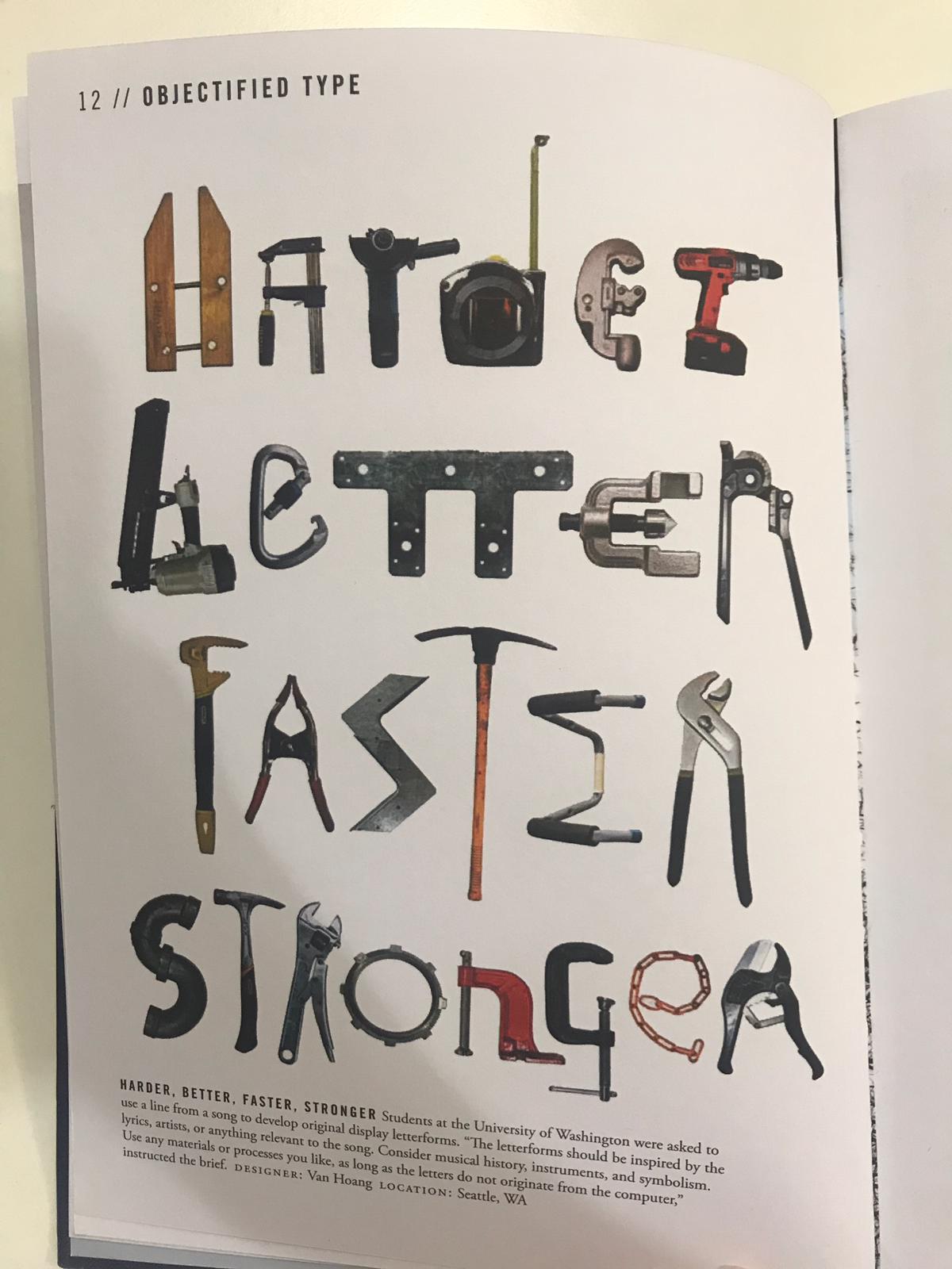
Now this book is another interesting one as I read through one of the chapters: Objectified Type. Basically it's about how our everyday life items turns into an alphabet. Since I'm about to do Type and Play, I thought this might be a good one to start with. I found a few interesting ones, like how they use tools and aligned it to form a word. It' something that I don't really put much effort into observing in everyday life.


Week 4
Typographic Communication Today


Hence, choosing the right typeface for a poster is important as they can help to better convey a message. In the 1960s there was a surge of expressive in typography, typography in which the type is physically positioned or modified so as to literally illustrate the primary statement. Many designers employed expressive typography very effectively.
Typographic Communication Today
Book cover
This book itself is humongous. As the title said itself, this book is about the history and evolution of typography. In Chapter XIII : The Many Faces of Typography Today, there's a quote that I really like: "The graphic designers is first and foremost a communicator, and only within that framework an artist." As a design student, sometimes I felt that I'm designing stuff just to enhance its beauty and make things look more appealing, but I forgot that the important part of it all is to be able to communicate with others using design.
Typeface/ Typographic symbolism
Each typeface, like each tone of voice or facial expression, conveys a mood and/ or a meaning. When the typeface is properly chosen and used, its very personality subtly, often powerfully, reinforces the message. (written in pg 124)

Week 5
Communicating with Typography

This online article provides tips and characteristics that can influence what type communicates, the main ones are: typeface and font, size, kerning, leading, color and capitalization. What's interesting is that even though I've learned all the above, the article provides clear sample images and how each characteristics can influence the way the type communicate to the readers. The article also goes on to explore different variation of type, such as experimental typography, typographic art and so on. The issue of readability is also explained in the article, in which it was concluded that type doesn't necessarily have to be readable to communicate, even though there is a sweet spot at the edge of readability.
Week 6
When Typography Speaks Louder Than Words

This article talks about how typography plays an important role in design, and how can it even speak louder than the normal graphic designs sometimes. They started by showing examples of how the use of spacing and sizing affects the overall message that the type is delivering. Then, they went on and gave examples of award wining typographic designs. One in particular that I find intriguing is one of the ads, where the author first explains about Type Tarts, which is a UK initiative established to raise awareness of the plight of workers trafficked into the sex industry. "Contributing designers are asked to send type-oriented “Tart cards” for exhibition. Many London prostitutes advertise their services by displaying promotional cards in phone boxes. Even in the age of the Internet and mobile phones and in the face of police crackdowns, these cards have achieved a cult following, being highly praised and collected as art. " . The authors then proceeded to show the works of people, and I was in awe of how the people manage to send the message metaphorically to its "intended targets".

I thought that it was genius that such simple ad with the use of rounded typeface was able to convey the message.
In conclusion, the power of typography is significant, and when placed under the right scenario, it can speak louder than words.

Comments
Post a Comment