Information Design

7/1/2019-22/3/2019 (Week 1- Week 7)
Lee Yu Hui | 0335787
Information Design
Instructions
Lectures
FLIP 1: Manuel Lima's 9 Directives Manifesto
On our first day of class, we were all divided into groups and was expected to do a presentation on Manuel Lima's 9 Directives Manifesto based on the sources given to us to make sure that we are all clear about this topic, however, time is a little bit rushing though as we were only given 2 days to prepare for the presentation.
Basically, Manuel Lima's 9 Directives Manifesto consists of 9 main directives:
1. Form follows Function
It is only from the problem domain that we can ascertain if a layout may be better suited and easier to understand than others. Independently of the subject, the purpose should always be centered on explanation and unveiling, which in turn leads to discovery and insight.
2. Interactive is Key
This creates a unique and personalized experience for each user, as they can decide what feels like the most interesting path to take. They can spend time with the content that excites them and dig deeper. Turn viewers into participants in your story through interactivity.
3. Cite your source
It is always important disclose where the data originated from to avoid any plagiarism!
4. The Power of Narrative
Storytelling is one of the most successful and powerful ways to learn, discover and disseminate information. Your project should be able to convey a message and easily encapsulate a compelling narrative.
5. Do not Glorify Aesthetics
Aesthetics are an important quality to many Information Visualization projects and a critical enticement at first sight, but it should always be seen as a consequence and never its ultimate goal.
6. Look for Relevency
We must be able to understand the goal of why we’re visualizing information, as it is to simplify complicated messages into easy-to-understand messages through visualizing information. It is also important to stay relevant and not go off course towards the visualization itself.
7. Embrace Time
If time had been properly measured and mapped, it would provide us with a much richer understanding of the changing dynamics of that social group. We should always consider time when our targeted system is affected by its progression.
8. Aspire for Knowledge
The core ability of visualisation is to translate information into knowledge.
9. Avoid Gratuitous Visualisation
Should respond as cognitive filter and empower lens of insight.FLIP 2: Saul Wurman's L.A.T.C.H
A couple of days later, we were given Saul Wurman's LATCH as a topic to present to the class about our understanding of the topic. In short, L.A.T.C.H stands for:
1. Location
The element "Location" is made to ask the question.
2. Alphabetic
Useful for searching up information in alphabetical order. Will be used when organizing large data in alphabetical order. E.g.: Name list, dictionaries.
2. Alphabetic
Useful for searching up information in alphabetical order. Will be used when organizing large data in alphabetical order. E.g.: Name list, dictionaries.
3. Time
Provides a simple form of organization. Used to view changes/make comparison. Shows information in chronological form. E.g.: Calendar, Historical Events.
4. Category
Used to organise types of information. Sorting helps designing relevant categories. Accessible for users and makes it easier. E.g.: Brochure, hastags.
5. Hierarchy
Used to give importance to a graphic element in a design. Provides a guide to the eye when looking into a design or an artwork.
FLIP 3: Miller's Law (Chunking)
Miller's Law refers to observation that an individual normally can retain or process only seven give or take two (7±2) items (chunks) of information in their correct serial-order, in his or her short-term (15 to 30 seconds duration) or 'working' memory. In short, chunking helps us to memorize and organize our information better, and it's visually more appealing to the eye.
Example of Chunking in design.
FLIP 4: Isometric Design as a good design practice
Isometric Design refers to method of drawing/creating a three-dimensional object in two dimensions.
Is it important in design as it allows viewers to easily and unambiguously read off the various dimensions from the drawing. The drawings are used to communicate between designer, client and manufacturer. Besides, it also helps to add flow and visual hierarchy to a design.

Examples of isometric design in games, typography and posters.
Isometric Designs may be confused with Perspective Design. But in short, isometric designs maps all objects of equal dimensions as the same size whereas perspective design maps the diminishing size of objects as they recede from view.
Assignments
Button Infographic Poster
After learning about manuel lima's 9 directive manifesto, we were assigned to do an infographic poster design. We first started out with counting buttons and observing them, then we uploaded the buttons along with the stats onto google drive.

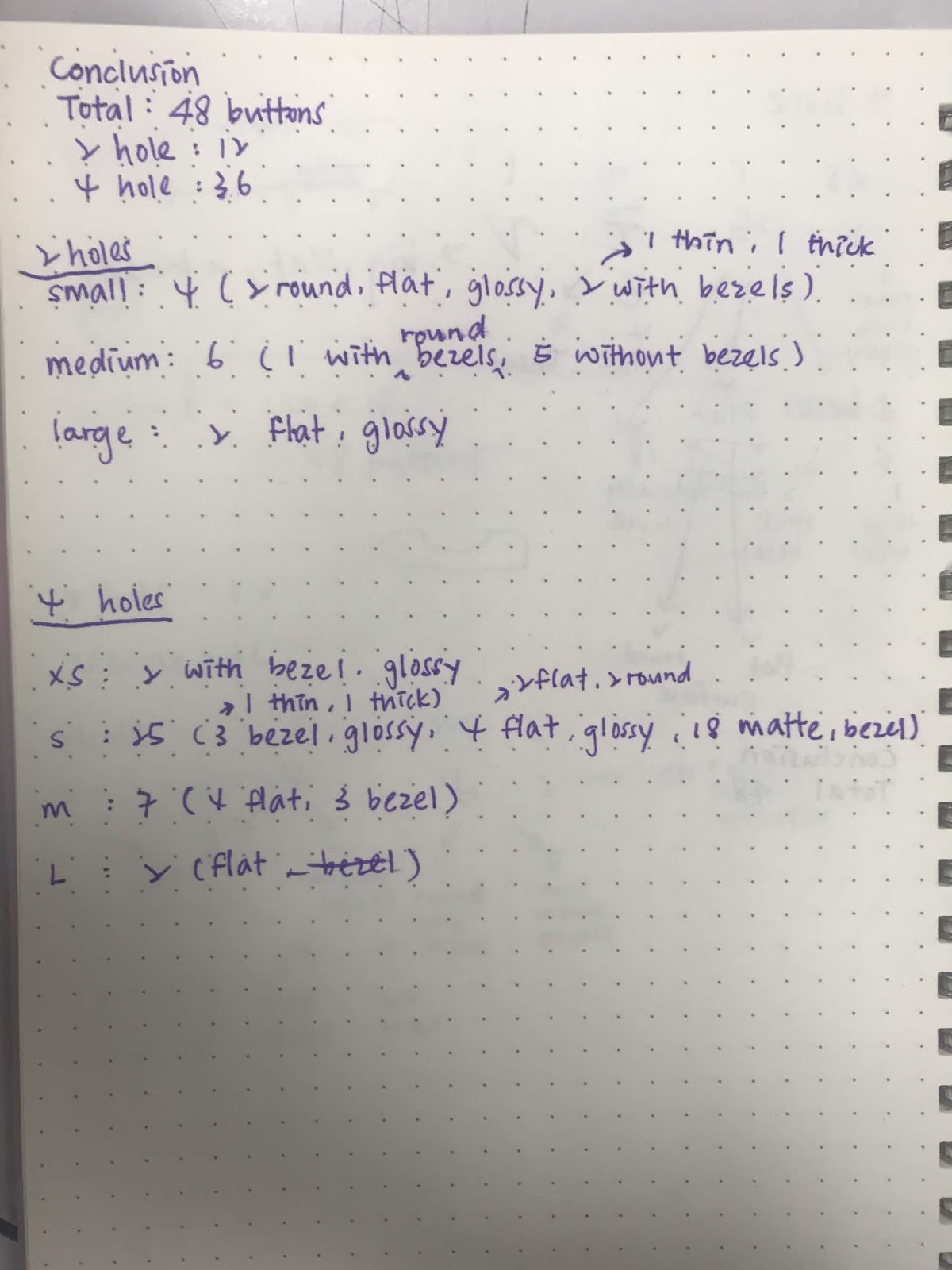
Figure 1.0 Pictures that were taken and uploaded to google drive.
Later, we were supposed to pick any 5 colors and make a infographic poster out of it. I sketched out how I wanted my poster to look like and how I'm going to present it.

Figure 1.1 My sketch for the poster
Voila! This is my final result!

Figure 1.2 My final outcome.
Pokemon Silent Animated Video
After understand what LATCH is, we were required to do a silent animated video on Pokemon based on the LATCH principles that we've learned. We somehow had to try to implement all 5 principles of LATCH into our design, and I feel like it would be a challenge.
I started off by doing some sketches on my sketch book to decide how I wanted my layout to be, then I went ahead to Ai to illustrate my objects.


Figure 2.0 My sketches for the layout.

Figure 2.1 Illustrating in Ai

Figure 2.2 Animating in Ae
After finish animating, this is my final result!
Recipe Poster
After coming back from the study trip, we were asked to do and hand in our recipe infographic poster. When I saw the examples online, I was amazed by other designer's skills and creativity. I start off by sketching the ideas that I had, and I actually had a few different sketches that I liked.

Inspiration for infographic poster
The drawing process is actually enjoyable as I had fun playing around with the composition and colors. After making a few adjustments here and there, this is my final outcome:

My final outcome.
Recipe infographic video
A week after the submission for the poster, we were told to do a 30-45 second video about the recipe that we made. The editing process was quite long as I tried my best to add in details like the sound of the salt shaking, water boiling and etc. It took me around 3-4 days to complete the whole video and I must say that I'm quite happy with the outcome.
Exercises
AE Refreshment
To allow us to have better skills and familiarize ourselves with After Effects, we were told to make a short and simple animated info graphic video with given theme. I chose to do the topic "animals" as I feel like I could relate more to it. Familiarizing myself with After Effects is one of the challenges that I faced during the process. However, there was another problem: We had to finish it under 3 hours.
I managed to finished it in the given time, and also managed to quickly picked up a editing skill that I learned through YouTube. After struggling to finish it by the given time, this is my final product.
AE Dynamic Numbers
For the following week, Mr. Jeffery showed us how to do animated dynamic numbers. The first few steps was simple, but it got harder in the end. Still, I'm actually enjoying animating in AE even though it's not easy. After showing us how to do the animated part, he then gave each group a topic to choose from and make an animated dynamic numbers based on the topic. My group chose to do activity tracker, and I had a rough idea of how I wanted it to be. The hardest part of all was the math part as we had to calculate the right number to make it work.
After struggling animated for hours, this is my final result!
Final Project
For our final project, we are required to make an infographic video based on topics that we chose. Our group consists of 5 person, which is me, Wafir, Ian, Joseph, and Sara. Initially we came up with the idea of making introverts vs extroverts. However, after having consultation with the lecturers, they advice us to choose topics that are less common. Hence we ended up choosing Autism vs Down Syndrome.
After choosing the topics, we went on to do research on the topics that we proposed, and we had a presentation based on the topics that we researched in.
After having that done, we then started writing our script. We took quite a while trying to finish the script as we're having our study trip soon. Nevertheless, we still manage to finish our script before the trip and we manage to move on to the storyboard.
Creating the storyboard was actually fun for me as we're all able to explore different art styles and the way we wanted to present our video. I would say the process is rather smooth except some parts that we struggled to think of the best way to present it. Other than that we had fun and we all enjoyed the process of storyboarding.

Our storyboard (sketch)
After getting the storyboard done, we started on our assets and voiceover. For our group, we decided to do the voiceover first so that it's easier to animate it in AE. We had Ian to do the voiceover recordings in the end and Joseph together with Ian are doing the assets for our video. We all settled on the flat vector art style as we liked the simplicity of it.

Assets for animation

Animating in AE
Animating in AE was so much fun, I enjoyed every bit of it. I've always been wanting to learn animation, and now that I got the chance to I'm actually pretty ecstatic. I got to play around with different effects and I learned a lot from YouTube.
Animating took us around 1 week time in total. Nevertheless, I'm really happy and proud of the outcome!
Here's our final outcome.

Comments
Post a Comment