Typography- Project 2

Lee Yu Hui | 0335787
Typography
Project 2
Lectures
Lecture notes
Week 9 - 24/10/2018
This week we had no lecture. We were taught to dissect the alphabets and then design our initials.
Instructions
Project 2 (Week 9 -Week )
Dissecting alphabets
Today, we were asked to dissect alphabets from our initials using the 9 typefaces that were given to us.
Using typeface Adobe Caslon Pro, I dissected my letter "H" into this:


Feedback
Week 9
When I showed my alphabet dissections to Mr Vinod, he said that it's interesting and and the structure is nice. Later on when doing the font design for our initials, I showed him my sketches and he say that it's interesting and he then told me to try to digitize it to see the outcome. After digitizing, Mr. Vinod and Mr. Shamsul said the curvy part looked awkward, and he gave me a few suggestions to improve it. After a few improvisation with the help of Mr. Vinod, he approved of my work.
Reflection
Experience
Week 9
Today we were told to dissect alphabets and design our initials based on the 9 typefaces that the lecturer gave us. Overall this week was less stressful compared to the previous weeks, and I actually had fun designing and dissecting the alphabets.
Observation
Week 9
I noticed that different alphabets had a certain traits depending on the font that we apply. Through dissecting aphabets, I learned a lot about the characteristics of an alphabet and how typographers uses them to imply on their designs to make them recognizable to the readers. It changed my view on alphabets and letters and it made me feel amazed how the little details in an alphabet can change or shape into a new thing.
Findings
Week 9
I find that designing the initials requires us to study the characteristics of the alphabets. We had to learn to observe the details in alphabets before we can start designing fonts.
Further Readings
Edit: A Guide to Layout, Design & Publication
Week 9

Week 9 - 24/10/2018
This week we had no lecture. We were taught to dissect the alphabets and then design our initials.
Instructions
Project 2 (Week 9 -Week )
Dissecting alphabets
Today, we were asked to dissect alphabets from our initials using the 9 typefaces that were given to us.
Using typeface Adobe Caslon Pro, I dissected my letter "H" into this:

Figure 1.0 My dissected letter "H"
Later, we were told to design the initials of our names according to the 9 typefaces that were given to us. I initially wanted to do a curvy kind of design to my initials, but Mr. Vinod says that it looks a bit too playful, and I agree too. Then, he suggests me to remove the curvy design instead and keep the pointy strokes on my initials.
Figure 1.1 My sketches for the initials.
Next, after doing the sketches, we were finally on to digitizing the initials! When I started on designing according to my sketches, I was a little unhappy about the design as I thought something was a little bit off, Mr. Vinod and Mr. Shamsul then told me the pointy stroke looked too awkward, I then decided to change things up and this is the final outcome.

Figure 1.2 My final outcome for initials design.

Figure 1.3 Compilation of my work.


Figure 1.4 Creating and generating font in FontLab.
Week 9
When I showed my alphabet dissections to Mr Vinod, he said that it's interesting and and the structure is nice. Later on when doing the font design for our initials, I showed him my sketches and he say that it's interesting and he then told me to try to digitize it to see the outcome. After digitizing, Mr. Vinod and Mr. Shamsul said the curvy part looked awkward, and he gave me a few suggestions to improve it. After a few improvisation with the help of Mr. Vinod, he approved of my work.
Reflection
Experience
Week 9
Today we were told to dissect alphabets and design our initials based on the 9 typefaces that the lecturer gave us. Overall this week was less stressful compared to the previous weeks, and I actually had fun designing and dissecting the alphabets.
Observation
Week 9
I noticed that different alphabets had a certain traits depending on the font that we apply. Through dissecting aphabets, I learned a lot about the characteristics of an alphabet and how typographers uses them to imply on their designs to make them recognizable to the readers. It changed my view on alphabets and letters and it made me feel amazed how the little details in an alphabet can change or shape into a new thing.
Findings
Week 9
I find that designing the initials requires us to study the characteristics of the alphabets. We had to learn to observe the details in alphabets before we can start designing fonts.
Further Readings
Edit: A Guide to Layout, Design & Publication
Week 9
Book Cover
Chapter 5: Fonts and Formats
Typography and Readability :
Every person who designs publications hopes product is readable and able to communicate their intended message. What actually contributes to making text readable is difficult to define. However there are some crucial elements that can greatly impact the way letters and words sit on a page. The five most crucial factors influencing the presentation of text are:
1 kerning
2 leading
3 tracking
4 alignment
5 font.
Kerning: Kerning is the distance between letters. Every letter in a book has a set distance of kerning separating it from other letters.

Examples of kerning
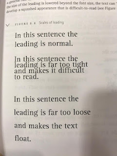
Leading: Leading is the term used to describe the distance between lines of type. Leading can also be adjusted to help text fit into an allocated space. However, when the leading is adjusted too much, the text will look squashed or strung out.

Examples of Leading


Comments
Post a Comment