Typography- Project 1

Lee Yu Hui | 0335787
Typography
Project 1
Lectures
Lecture Notes
Week 7- 5/10/2018
Typography: Font Type and Style
This week we were given a lecture about types of fonts. In summary, fonts can be divided into seven categories: Serif, San Serif, Display, Script, Text, Mono-spaced and Dingbats.
Serif: Serif fonts are the most common text / body text font. Serifs refer too the little feet or arms that hang off the end of letter strokes.


Serif: Serif fonts are the most common text / body text font. Serifs refer too the little feet or arms that hang off the end of letter strokes.

Figure 2.0 Sub categories in serif fonts.
San Serif: Sans Serif are fonts without serifs and usually have an overall even stroke weight, which creates little contrast for the letters. Sans Serif fonts can evoke a more modern look for a report but some feel can be harder to read in comparison to a serif font.

Figure 2.1 Examples of San Serif fonts.
Display: Display are decorative fonts and are designed to be used as attention getting headline fonts. They should rarely, if ever, be used as a body copy fonts.

Figure 2.2 Examples of Display fonts.
Script: Script fonts are designed to mimic handwriting, therefore, the letters are designed to touch one another. These fonts may be the more traditional type used for formal invitations. Script fonts should never be used in all capitals.

Figure 2.3 Exmaples of Script fonts.
Text: Based on the hand-drawn letter made by early monks for religious books, text fonts have an “old-world” feel to them. They are mostly used for certificates, diplomas and invitations. As with script fonts, they should never be used in all capitals.

Figure 2.4 Examples of Text fonts.
Mono-spaced: Most fonts are proportionally spaced; that is smaller characters take up less space than larger ones. For example the letter “i” is nots as wide as the letter “M”. In contrast, mono-spaced fonts, which are usually typewriter-style fonts, take up the same amount of space regardless of the actual letter.

Figure 2.5 Examples of Mono-sapce.
Dingbats: Dingbats are symbols that are small pieces of art to enhance the design of the text or page. While Zapf Dignbats and Wingdings are the most common dingbats, there are hundreds, if not thousands, of different designs available.

Figure 2.6 Examples of Dingbats.
Instructions
Project 1 (Week 7- Week 8)
Text Formatting
In short, we were asked to do a text formatting by using kerning and such. We were introduced to a new software, which is Adobe InDesign, and we used it to do our text formatting and such.

After learning to kern the paragraphs, we were asked to do our very first project, which is to design letter expression in a form of sentences. In short, we had to express the whole sentences using InDesign and Illustrator. To be honest, I think this project might have been the hardest and the most stressful one so far as I kept being told that I need improvement on my work. I couldn't really grasp the whole concept of having a good expression on a letter, thus making me feel stressful than ever.
When I first designing my book cover, it was black and white,and the whole book cover was a little messy. Mr. Vinod advised me to not use diagonal lines to try separate the words. And so after doing some adjustments here and there, this was my final outcome.


Feedback
Week 8
I noticed that a lot of my classmates are having the same problem as I do. We were cracking our heads to figure out what we have to do. The lecturers are quite stressful as well as we have a tight schedule. In short, everyone's having a quite stressful day today. We spent the whole class trying to do the project today.
Week 8
I had a rough and stressful day today as I had a hard time understanding what the lecturers actually want. Though I was pleased to know that Mr. Shamsul liked my book cover, I still have to work on my type expression, which for me is the hardest part of them all. I hope that I could master this as I liked doing type expression.
Further Readings
Handfont, Handwork
Week 7


Week 8- 18/10/2018
There was no lecture this week, we were told to do our type expression in class.
Instructions
Project 1 (Week 7- Week 8)
Text Formatting
In short, we were asked to do a text formatting by using kerning and such. We were introduced to a new software, which is Adobe InDesign, and we used it to do our text formatting and such.

Figure 2.7 Outcome after kerning.
When I first designing my book cover, it was black and white,and the whole book cover was a little messy. Mr. Vinod advised me to not use diagonal lines to try separate the words. And so after doing some adjustments here and there, this was my final outcome.

Figure 2.8 My final book cover.
After finishing the book cover, I went on with expressing the sentences. This was the hardest part for me as I couldn't meet the expectations that the lecturers want. I made a few designs but Mr. Vinod says it's not supposed to look like that, so after making a few adjustments, this was one of the outcomes:

Figure 2.9 One of my outcomes.
Since I did this at home, I emailed Mr. Shamsul to let him review my work. He gave me a few suggestions, one of them saying that the expression was somewhat minimal, and he thought that the arrow on the "demand" was a little awkward. He suggests me to refine the arrows so that it doesn't look too awkward.
I took Mr. Shamsul's advice, and made a few needed adjustments, and this was my final outcome.


Figure 3.0 My final outcome.

Figure 3.1 Thumbnail of my project.
Figure 3.2 My final work.

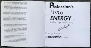

 Figure3.3 My printed out booklet
Figure 3.2 My final work.


Feedback
Week 7
Mr. Vinod and Mr. Shamsul didn't give a feedback on my type expression as I have done it previously. However when it comes to text formatting, Mr. Shamsul commented that my alignment is ok but he suggests that I set my leading to 15pt instead of 14.
Week 8
After making several designs and adjustments, Mr. Shamsul said he liked my book cover. The composition is nice and it looks great in general. However, he told me that my expression was not there yet, some of the designs looked a little childish, and I needed a lot of improvement. Mr.Vinod advised that I do not use diagonal lines in my design, which is what I did in my initial book cover. After getting approval for the book cover, I then went on with my type expression. For the first design, Mr. Vinod said I should make use of the space better as I was leaving too much white space. For the second design, Mr. Vinod said that I should focus on the essence of the sentence, and not trying to design each and every word in the sentence. For the third design, Mr. Shamsul said that I should never try to distort the typefaces.
Week 10
After viewing my work, Mr. Shamsul and Mr. Vinod said that I shouldn't leave white spaces and that I didn't have to express every word in the sentence.
Reflection
Experiences:
Week 7
Today we had a lecture as well as diving into Adobe InDesign. It was the first for me and I have to say that it's a bit harder than I anticipated. It was hard for me to grasp the idea of text formatting, as I didn't know what counts as a good text layout. Nevertheless I had fun kerning the texts but I'll have to spend more time exploring into this field.
Week 8
Today is stressful for me as we were given 2 weeks to finish our project but I couldn't come up with an idea. Overall I was a bit lost and stressful at the same time. It's still a little hard for me to understand what the lecturers wanted.
Observation:
Week 8
Today is stressful for me as we were given 2 weeks to finish our project but I couldn't come up with an idea. Overall I was a bit lost and stressful at the same time. It's still a little hard for me to understand what the lecturers wanted.
Observation:
Week 7
I noticed that most people are a bit lost and were unfamiliar with InDesign. We didn't know what to do and we were constantly asking for approval of our work due to us not understand enough how the software works. Though Mr. Vinod had explained to us the basics of it, we still needed some time to take in the information.
Week 8
I noticed that a lot of my classmates are having the same problem as I do. We were cracking our heads to figure out what we have to do. The lecturers are quite stressful as well as we have a tight schedule. In short, everyone's having a quite stressful day today. We spent the whole class trying to do the project today.
Findings:
Week 7
I noticed that I had a hard time figuring out what to do in today's class as everything seemed vague to me. Though we were given instructions on what to do, due to the unfamiliarity of the software, I had to constantly ask for guidance from the lecturers and friends.
Week 8
I had a rough and stressful day today as I had a hard time understanding what the lecturers actually want. Though I was pleased to know that Mr. Shamsul liked my book cover, I still have to work on my type expression, which for me is the hardest part of them all. I hope that I could master this as I liked doing type expression.
Further Readings
Handfont, Handwork
Week 7
Book Cover
Well, this book was quite something. This is a book written by a Japanese. It's kind of weird since most of the pages in this book is made up of pictures and graphics and it's basically showing how you can use different typefaces in different designs and how you can have fun playing with them.
Different Typefaces
Few pages from the book.
Type Style Finder
Week 8
Book Cover
At first glance, this book cover looks very colorful and it looks like it has a lot going on in the background. It didn't appear to me as the "most attractive book", but the content seemed interesting enough.
Section II: The Type Style Finder
The concepts or moods they convey may vary among audiences, but part of a designer's task is to target his or her audience as directly as possible and thus understand how the forms of given type styles might resonate better with them.
Mood: Friendly
In terms of type, friendly faces are just like friendly faces in a design studio: open, smiling, ready to work and to have fun doing it. Large x-heights and counters, open apertures, a minimum of details- but unexpected ones here and there- create welcome legibility and entry into text, as well as some fun at larger sizes where an unusually loopy bowl, an unsually small title, or a sprightly spur may add a little adventure to the line.

Friendly typefaces
Friendly Color
As a general rule, if it's orange, it's a friendly- a saturated, slightly redder orange, as opposed to the spicier, more sophisticated orange that becomes a little too earthy or sophisticated to be truly friendly. Sweet colors, such as reds with a hint of violet in them or apple-y greens are also friendly and help cool and refresh the heat of orange. Golden yellow, approaching orange in character but not quite there, is sunny but has the adventurous overtone of orange. Slightly desaturated colors in this range can also be friendly and somewhat more relaxing than the brighter, more brilliant versions of the same colors. Placing a more saturated and less saturated versions of the same color.
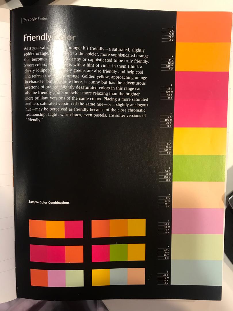
Friendly colors

Comments
Post a Comment