Design Principle- Exercises and Projects

27/8/2018-(Week 1-Week 8)
Lee
Yu Hui (0335787)
Design
Principles
Exercises and Projects
Instructions
Week 1
Introduction to Design Principles and Contrast
For our first class, we started off with the topic "Contrast". Miss Sherry showed us a couple examples of contrast and briefly explained the concept of contrast.
-Contrast is the arrangement of opposite elements (light vs. dark colors, rough vs. smooth textures, large vs. small shapes, etc.)


Figure 1.0 Samples of Contrast
Miss Sherry also asked us to do a drawing about contrast, which were then all presented and given feedback.

Figure 1.1 My artwork about contrast.
Feedback:
Miss Sherry said it has a strong contrast but I might need to do the coloring better as the edges were a little rough.
Week 2
The Gestalt Principle
This weeks lecture Miss Sherry taught us The Gestalt Principle, which were being used in different designs.
Gestalt is a psychology term which means "unified whole". It refers to theories of visual perception developed by German psychologists in the 1920s. These theories attempt to describe how people tend to organize visual elements into groups or unified wholes when certain principles are applied.-- reference from Wikipedia.
The basics of Gestalt Principles are:
- Similarity
- Proximity
- Closure
- Good Continuation


Figure 2.0 Samples of Gestalt.
When I first started my assignment on Gestalt Principle, I find it really difficult to come out with ideas as Gestalt is more on the abstract side. Initially, I wanted to look for something symmetrical for inspiration for my artwork as I noticed that symmetry is one of the elements that made out Gestalt. Hence I did a Gestalt artwork on lips.

Figure 2.1 My initial artwork on Gestalt
But after showing my work to Miss Sherry, she said that the artwork is okay, but the fish on the upper lips isn't obvious enough, and the white strokes on the lips is a little distracting as it looks like fangs.
Later after I went home, I decide to look up for more information about Gestalt, and while scrolling through some pictures, a Disney Princess Gestalt caught my eye.


Figure 2.2: Disney Princess Gestalt.
I then decided to do my next artwork inspired by one of my favourite childhood stories: "The Little Red Riding Hood".

Figure 2.3: My final artwork about Gestalt.
Feedback:
Miss Sherry said that it was nice overall, she can see the cat/wolf behind the little girl. The leaves made out the eyes of the wolf.
Week 3
Symmetry, Asymmetry, Balance and Dominance
For this weeks lecture we're all divided into groups to make a presentation about certain subjects, and for this week's lecture, we were brought by our fellow classmates.
-Symmetry: The quality of being made up of exactly similar parts facing each other around an axis.


Figure 3.0 Samples of Symmetry
-Asymmetry : lack of equality or equivalence between parts or aspects of something; lack of symmetry.

Figure 3.1 Sample of Asymmetry
-Balance and Dominance : Balance is a feeling of equality in weight, attention, or attraction of the various visual elements within the pictorial field as a means of accomplishing organic unity, while dominance is the principle of visual organization that suggests that certain elements should assume more importance than others in the same composition.


Figure 3.2 Samples of Balance and Dominance.
Picture on the right is a famous art painting named "The Great Wave off Shore at Kanagwa", painted by Japanese artist Katsushika Hokusai.
When I first started on my artwork, I was thinking about animes, and how animes had a "dark scenario" portrayed in the show, hence I decided to recreate similar scenes with my own twists, as I think it represents the theme in dominance/emphasis well.


Figure 3.3 Inspirations of my artwork.

Figure 3.4 My final artwork
Feedback:
Miss Sherry said that the crowds look nice, it has a good asymmetry elements in it. I told her that my artwork was inspired by an anime scenario, and she reminded us to be aware of our artworks so that we could put our own elements into our artwork and not just intimidating from people's work.
Pattern, Repetition, Texture, Surface
This week, our fellow classmates talked about patterns, repetition, texture and surface.
Pattern: The repeating of an object or symbol all over the work of art.
Four general types of pattern:
-Branching: Obvious form of patterning in the plant world.
-Spiral: Can be seen from the scale of galaxies to the opening "fiddlehead" buds of ferns, to forms of microscopic animals.
-Flow: Follows the path of the least resistance.
-Packing and Cracking:Refers to the way in which compacted cells define each others shape.


Figure 4.0 : Samples of pattern.
Repetition: Repeating a single element many times in a design. The principle of repetition simply means the reusing of the same or similar elements throughout your designs.

Figure 4.1: Sample of repetition.
Surface: Refers to the outermost/uppermost layer of a physical object/ space. It is where any type of median is applied on. Surface also allows us to see things in 2 dimensional perspective but we would know what it is made of.


Figure 4.2: Samples of surface
When I started on my artwork, I was a bit lost and out of ideas as I think its hard to come out with an original idea. I did my artwork several times but I could hardly find the ones that I truly liked. I've worked with oranges, strings and some other stuff to work on my project.
For this artwork, a classmate of mine Joseph commented that he liked the colorful colors in the artwork. I told him that my artwork was inspired by Andy Warhol's pop art poster print, which was why I colored my artwork that way.

Figure 4.3 My artwork inspiration

Figure 4.4 My initial artwork.
I wasn't really satisfied with it as I didn't like the way it turned out, the orange print turned out blurred and the background colors weren't solid enough to my liking.

Figure 4.5 My second artwork
Because I wasn't satisfied with my first artwork, I decided to do a second one, which I use paintbrush to dab on the paper to create flowers, and I also cut out cork boards and made it into a cloud shape and simply stamp it on the paper. The artwork turned out okay, but I feel like it wasn't anything special.

Figure 4.6 My final artwork.
Finally at this point, I got kind of frustrated and decided to give it a last try. I used strings to create the blue strokes , and I used the orange to stamp onto the paper. I also added green stripes to make it look more interesting.
Feedback: Miss Sherry said I could work more and use more different kinds of object to make an artwork look more interesting.
Week 5
Alignment, Hierarchy, Placement, Direction
This week we were presented about alignment, hierachy, placement, and direction.
Alignment: Is the arrangement of visual elements so they line up in a composition.
Types of alignment:
-Edge Alignment :Determines the arrangement of elements in relation to the edges of the page/canvas

Figure 5.0 Sample of Edge Alignment.
-Center Alignment: Is where elements are aligned to the center.

Figure 5.1 Samples of Center Alignment
-Visual/ Optic Alignment: Fixes some of the problems that can occur with other types of alignment due to the varying shapes of letters and graphics.

Figure 5.2 Samples of Visual/ Optic Alignment
Visual Heirachy: It refers to the arrangement or presentation of elements in a way that implies importance.
Types of visual heirachy:
1. Scale
2. Color and Contrast
3. White Space
4. Proximity
Placement: The change and position of shapes or objects that can affect the visual depth and composition of an artwork.

Figure 5.3 Samples of Placement.
Direction: Is about leading the eye to the next location.
Direction is also branched out into:
-Vertical Direction
-Horizontal Direction
-Diagonal Direction

Figure 5.4 My initial alignment and composition.
After the first alignment I wasn't too sure if I liked it, so I've cut out some inspiring words to try to make it look like a poster-type-ish artwork, and this is what my final artwork looks like:

Figure 5.5 My final artwork.
Feedback:
Miss Sherry said that the way I compose it is not center alignment, and she said that the couple in the photo looked happy and positive, same as the message that I'm trying to deliver: To pursue your dreams.
Week 6
Dot, Line, Scale, Size
Dot: The smallest and most basic element of graphic design.
Dots are the building blocks of everything else. Every shape, form, mass, or blob with a center is a dot regardless of its size.
 Figure 6.0 Works/ Designs using dots.
Line: Line could be used in a lot of different artworks, and it can create interesting designs if used correctly. It doesn't necessarily have to be in a straight line, we can also create interesting designs using curved lines.

Figure 6.1 Artworks using lines.
Size: Simply the relationship of the area occupied by one shape to that of another.
Size can be used to convey important, attract attention and create contrast, to make a particular element stand out or give it importance.

Figure 6.2 Posters/ Designs using size
Scale: Refers to the size of an object in relationship to another object. In art, the size relationship between an object and the human body is significant. In experiencing the scale of an artwork we tend to compare its size to the size of our own bodies.
Scale creates emphasis, drama, and aids hierarchy.


Figure 6.3 Movie posters and paintings using scale.
For this weeks assignment, we were given choices to use mixed medium in our artworks. I found my inspiration when I was looking through designs of flamingo with the palm leaves and all, and so I decided I would do a mix of collage with watercolor.

Figure 6.4 My artwork inspiration
Since this weeks topic was about dot, line, scale, size, I decided to make a little twist by using these theories in my background instead, as I still wanted to maintain my original idea. I made my first design and showed it to Miss Sherry, in which she replied that it's interesting that I decided to use patterned papers in my work.

Figure 6.5 My artwork.
Harmony: Harmony can be described as sameness, the belonging of one thing with another.
There are two types of harmony:
-Visual Harmony: When an artwork is unified by colour, shape, composition or some other visual design principle

Figure 7.0 Sample of Visual Harmony
-Conceptual Harmony: When an artwork has a common theme or concept throughout it.
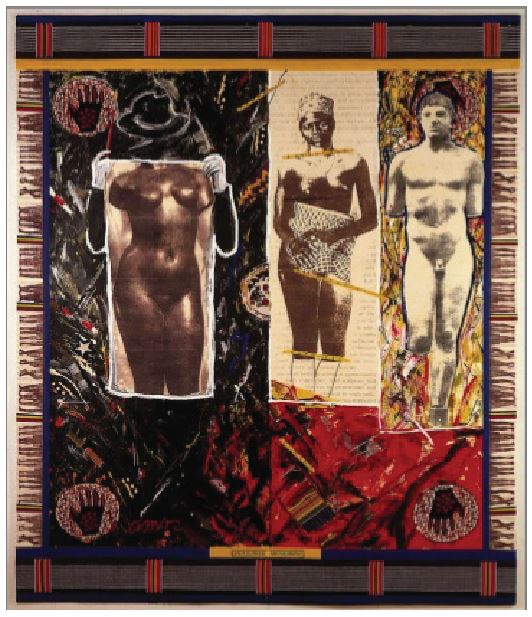
Figure 7.1 Sample of Conceptual Harmony
Movement: Movement is the path of the viewer’s eye takes through the work of art often to focus of areas. Such movements can be directed along lines, edges, shape and color within the work of art.
Figure 7.2 Samples of movement
Rhythm: Rhythm indicates movement, created by the careful placement of repeated element in a work of art to cause a visual tempo or beat
4 types of Rhythm:
-Regular rhythm
-Progressive rhythm
-Alternating Rhythm
-Random rhythm
-Regular rhythm
-Progressive rhythm
-Alternating Rhythm
-Random rhythm
Regular rhythm: Regular rhythm occurs when the intervals between elements are similar in size or length. Basically its like repetition.

Figure 7.3 Samples of Regular Rhythm
Progressive rhythm: Progressive rhythm occurs when there is a gradual increase or decrease in either size, number, colour, or some other quality of the elements is repeated.
Figure 7.4 Sample of Progressive Rhythm
Alternating rhythm: Alternating Rhythm occurs when there is two or more motifs that are alternated creating an overall piece. Elements may not necessarily be identical to one another but it is similar.
Figure 7.5 Sample of Alternating Rythm
Random Rhythm: A Random Rhythm is created through similar elements or motifs that are repeated with no consistency, basically a random rhythm but in the end, the final piece could still be seen as a whole.
Figure 7.6 Sample of Random Rhythm
For this weeks exercise, we were told to take pictures that represent any of the three elements (harmony, movement, rhythm), and I wanted to take pictures about movement, as I know I can do a lot with it. I played around with my camera settings can decided that I would shoot car movements at night.

Figure 7.7 Outcome of my photography

Of course, I didn't get this outcome in the first attempt, I made several attempts on taking this picture as I have to stable my camera on a fence using a gorillapod.

Figure 7.8 Another outcome of my photo.
I took these photos beneath the SS15 LRT station, and by that time I was lucky that there's still quite amount of cars moving to able me to take these photos.
Besides taking pictures outdoors, I initially also took some pictures indoor with my friend as my model. I played around with different light settings and long exposure to create a stunning light paint effect.
However, there was a couple obstacles when taking the picture as the space is small and cramped, I did not have a lot of room to move around, and so in the end I gave up on the idea.
Feedback: Miss Sherry liked the photo as well as the details in the photo. She liked the lights and little details on the road. I'm glad that Miss Sherry liked my work.
Week 8
Figure/ Ground, Shape/ Form
Shape/ Form: In short, shapes are mostly 2D while forms are mostly 3D.
Shapes: Shapes are 2 Dimensional and they can describe the two dimensional space.
Basically, there are 3 main geometric shapes, they are square, triangle, and circle. Shapes are like the brains attempt at resolving an object as recognizable to one's experience. Objects and environment that are recognizable to us are referred as being Realistic/ Naturalistic.

Figure 8.0 Pictures of shapes and how we could use them.
Forms: Forms are three-dimensional. It gives dimension, volume, texture and space. 3 dimensions can be done by adding lines, tones, or color. Form as an idea, indicating the characteristics of how we see something rather than how something is present as it is.

Figure 8.1 Recognizable shapes to us.
Figures/ Grounds: In short, we can use blur as an element to help us distinguish between figure and ground. Figure often means the subject that we're trying to focus on while grounds means the background of a picture/artwork.
Size and Contrast is also used to help us distinguish between figure and background.
For this weeks exercise, we were given the freedom to use any media that we wanted, so that gives me more freedom to explore the medias that I wanted. I firstly thought about making abstract geometric shapes, however I quickly shook off that idea as I'm not good at abstract, and I thought that having only shapes in an artwork is a bit boring, hence I decided to go for another route.
Since this weeks topic was about figure and ground, as well as 2D and 3D, I wanted to make a patterned circle dots with a little bit of shadow to make it look more interesting and relevant. Then suddenly, I thought of a movie that I watched when I was a child, which is a movie talking about a girl who likes to dance, however due to some circumstances she would turn into a swan at night. I then decided to merge the two together in an artwork, since I know there's a popular dance named swan lake in ballerina.

Figure 8.2 My final artwork.
Week 9
Proximity/ Perspective/ Proportion/ Unity/ Variety
Proximity: Proximity is grouping and shaping of objects in a composition. Objects near are seem as a unit. Proximity is used to either create connections or to dispel connections.
In short, proximity is influential to the balance and hierarchy design principles. It is essential to help organize information weather it's in an artwork or a poster. Having proximity can help convey message, engage an audience, add emphasis to a portion of a layout and create dynamics.

Figure 9.0 How using shapes can create proximity.
Perspective: Artists use perspective to represent three-dimensional objects on a two-dimensional surface in a way that looks natural and realistic. Perspective can create an illusion of space and depth on a flat surface.
Perspective can be divided into 2 categories:
1. Atmospheric Perspective
2. Linear Perspective
- One Point Perspective
-Two Point Perspective
-Three Point Perspective

Figure 9.1 Example of one point perspective.

Figure 9.2 Example of two point perspective
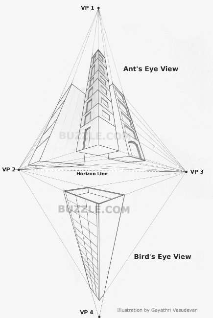
Figure 9.3 Example of three point perspective.
Proportion: The harmonious relationship between 2 or more elements that are put together in a composition so that all elements work together and no one element takes over and is too dominant, or is so small to be ineffectual.
In a nutshell, proportion can help create unity in a design. It can also help add harmony, symmetry or balance, among the parts of design as a whole.
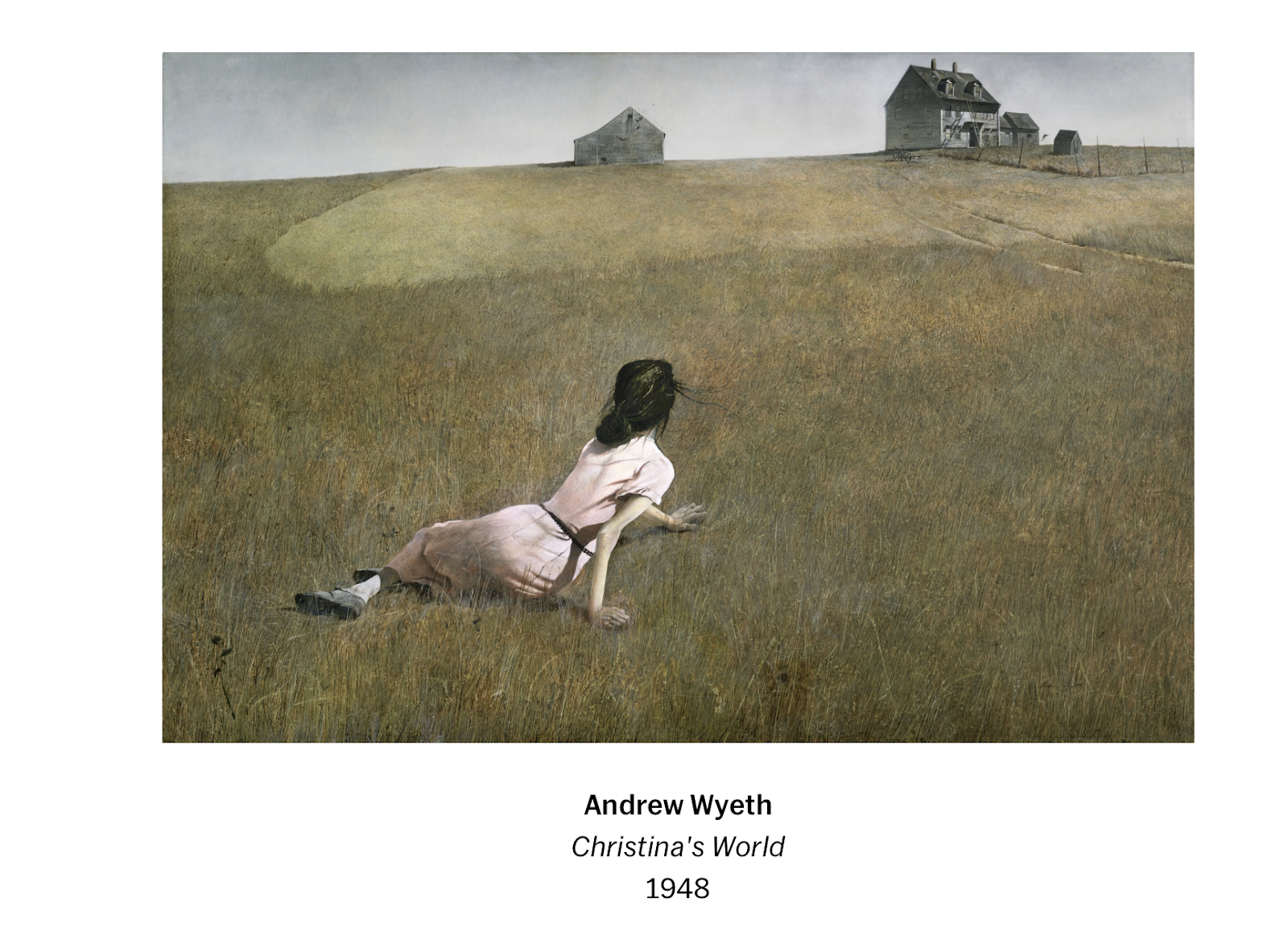
Figure 9.4 Example of good proportion.
Unit/ Variety: Unity in an artwork creates a sense of harmony and wholeness, by using similar elements within the composition and placing them in a way that brings them all together.
Variety adds interest by using contrasting elements within the composition.
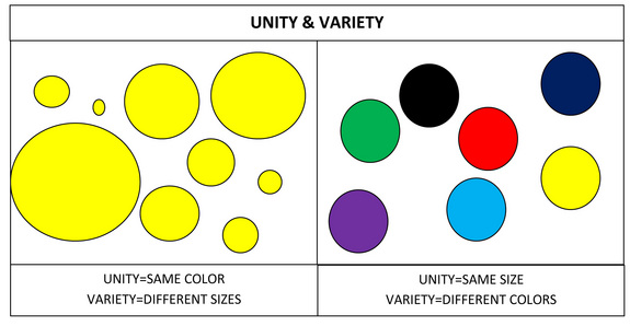
Figure 9.5 Examples of unity and variety.
Unity: Designers use unity to make elements in a composition appear to belong together. When each elements has a clear visual relationship to one or more elements, the composition is unified. (Credit Source: http://graphicdesign.spokanefalls.edu)
Figure 9.7 Examples of Unity.
Variety is about varying elements and objects in your image, to avoid making them boring. Variety can also be varying your angles, exposure, composition. The image below has variety because each shell is completely unique. (Credit source: trentsizemore.com)

Figure 9.6 Examples of Variety
Since I've always been into photography, I decided that I wanted to use it as my media for my artwork. I already had a rough idea of where I wanted to take the picture in, since I had to go through that place every single day.


Figure 9.7 My initial photograph
After making a few adjustments, I thought about adding a few textures to make it look more interesting. I thought of using photshop to combine work between 2D and 3D to make it pop out more.

Figure 9.7 My final outcome.
I actually liked the outcome as I thought the human silhouette in white really attracts viewers attention. I feel kind of relieve but sad at the same time as this is my last exercise.
Project 1 : Self Portrait
Week 7 - Week 9


After doing weeks of exercises, we're finally moving on to our very first project. Miss Sherry told us to do a self portrait of ourselves using any media of our choice. We have to express who we are through our artworks. At first, I wasn't quite sure what media to use, as I wanted to make it special since it was a self portrait about me.
Firstly, I list out my traits and things that I like on a piece of paper so that I can get a better picture of what I wanted to draw.

Figure 1.0 Lists of my favorite things
Next, is time for sketching! At first, I thought of drawing my thoughts/ traits inside my head, but that idea quickly got discarded as I thought many people were doing the same thing, and it would be kind of complex to draw it out in a limited space.

Figure 1.1 My initial sketches
After making the first sketches, I wanted to move some objects around as I think it's quite crowded, and after making a few adjustments, it's time for coloring!
For the coloring part, I decided to go with watercolor in the end. However, I wanted to go with a slightly different color style. I've been reading a web comic these past months and I wanted to try out their painting style.

Figure 1.2 My art style inspiration

Figure 1.3 My final artwork.
Project 2: Sense of Place
Week 9 - Week 10
For the second project, we were told to do artworks based on the place that we were familiar with, and again, we were allowed to use any media that we want. Since I'm living in a dorm in SS15, I wanted to make something different using Photoshop.
Miss Sherry advised us to go to the place several times to get different shots of the place we intend to do, so I took different pictures of it in different time zone.
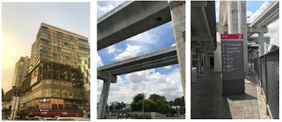

When I first started editing the pictures, I wasn't sure where I wanted to place it and how I wanted it to look like, but I specifically liked the SS15 Courtyard building picture taken on an evening (Top left corner of Figure 2.0). I think it shows a lot and it has a harmonious atmosphere to it though it's beside a busy road.


Miss Sherry advised us to go to the place several times to get different shots of the place we intend to do, so I took different pictures of it in different time zone.


Figure 2.0 : Pictures I took near SS15 LRT station during different time of the day.

Figure 2.1: My initial design
After making a few adjustments, this was what I came up with after combining photos together. However, I thought of adding more texture to it to make it look more interesting and to make it look more relatable.

Figure 2.2 : My picture after adding in texture.
I was quite happy with how this turned out, it has the iconic buildings and structures in that photo. But I thought that SS15 wouldn't be complete without the LRT Station, hence I added one last touches to it.

Figure 2.3 : My final artwork.
I was pretty satisfied with the final outcome as I think this is pretty relatable and iconic. It kind of serves as how I view the place in a picture since I'm seeing this everyday as I had to take the bus to school. Overall, this was a fun project and I had fun taking pictures of it during different time of the day. It made me view the place in different angles and perspective. I'm glad to say that I've learned quite a lot about where I'm living.
Final Project :
Week 11 -Week 14
For the final project, we were asked to observe the billboards and take inspiration from it and create an artwork. Fortunately, living in Subang gives me an advantage as there are a lot of billboards everywhere.


Figure 3.3 Sample images that I took.
Now, looking at these billboards, it reminds me of how advertising has grown over the years, from art style, media and graphics. Advertising is now indulged in our everyday lives, and advertising has grown more and more closer to our lives, from being from papers and magazines, now it has spread to being a common thing on televisions and social media, whilst in the meantime, I feel like us humans are slowly exposing ourselves to dive in into the VR world, which we can see over these years how VR games has slowly become a common thing to us. It shows how humans are evolving and how we're beginning to see our future world. In 100 years time, what would be for our future?
So, the idea of VR and the reality rose to me. I decided to use digital painting as my mode of drawing as I never used this media in Design Principles class before and I think it's easier to make changes throughout the process.
I first did my sketches on my sketchbook to see how I want to express it.

Figure 3.4 My sketches
Then, I move on to digitizing it on photoshop. I first did some rough sketches according to my original sketches on paper.

Figure 3.5 My digital rough sketch.
Next, it's time to do lineart! Lineart took me quite a while as I wasn't really familiar with building sketches and it's hard to perfect the lines.

Figure 3.6 My lineart
Moving on, I did the base color. Coloring took me quite a while since I had to figure out where's the shadows and highlights.

Figure 3.7 After putting up the base color.

Figure 3.8 After finish digitizing it
After I finish all my coloring and drawing, I notice that something was missing. I feel like it needs something to express the comparison between both worlds. That's when I thought of making it "reflective", so that it "reflects" two different worlds. Miss Sherry also commented that my airplane wings is in the wrong shape, so I then made a few adjustments.

Figure 3.9 After adding reflections.

Figure 3.10 Final outcome.

Comments
Post a Comment